A website is now a necessity in today’s internet-driven society. There is no need to break the bank when starting a small business, personal blog, or portfolio. Discovering the most affordable website builder is now easier than ever before, all because of the proliferation of user-friendly platforms.
Table of Contents
What Makes a Website Builder Affordable?
Monthly cost isn’t everything when considering affordability; value is key. Among the most advantageous features provided by top-tier budget builders are:
1- Drag-and-drop design tools
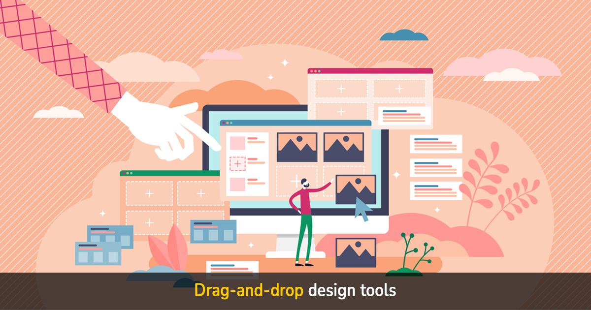
No coding experience is necessary when using drag-and-drop design tools to create a website. Elements such as text, photos, buttons, and forms can be precisely positioned on the page with these tools. With this straightforward method, even those without coding experience may make a high-quality website in a matter of minutes.
2- Mobile-responsive templates
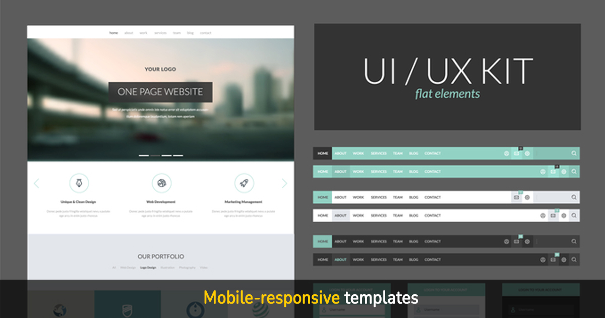
Your website will look fantastic and run seamlessly on all devices—desktops, tablets, and smartphones—when you use a mobile-responsive template. These pre-made layouts effortlessly adapt to different screen sizes by adjusting the text size, pictures, and layout. More people are utilizing mobile devices to access the web than ever before, making mobile-responsive design a must-have for every serious website.
3- Free or low-cost hosting
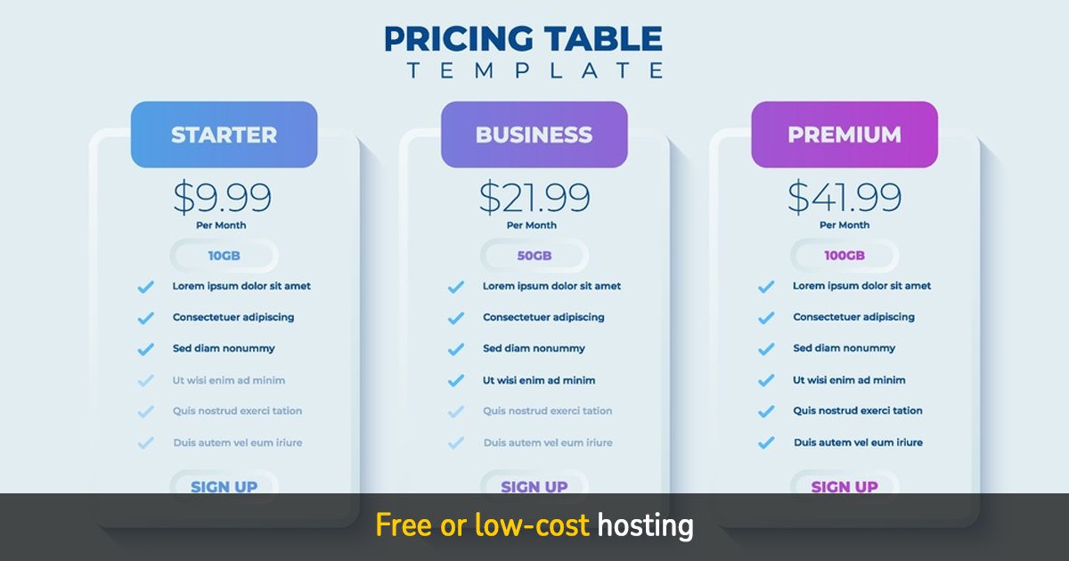
Publishing your website online doesn’t have to break the bank if you choose free or cheap hosting. Instead of searching for and paying for a separate service, you can find that many cheap website builders include hosting in their plans. In a nutshell, this ensures dependable performance and uptime while making it easier and cheaper for novices and small enterprises to launch their site rapidly.
4- Built-in SEO tools
Websites with built-in SEO tools have an easier time being discovered online since they score higher on search engines like Google. Common capabilities seen in such programs include the ability to change meta tags, receive keyword suggestions, optimize images, and automatically generate sitemaps. Anyone, even those without a technical background or experience with plugins, can use them to boost their site’s visibility.
5- Basic eCommerce features
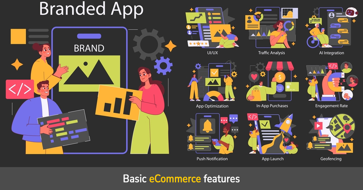
Using your website to offer products or services doesn’t require a complicated setup, thanks to basic eCommerce functionality. Products pages, a shopping cart, a way to securely handle payments, and an order management system are all examples of what is usually included. With their help, anyone can set up an online store and begin taking payments with no time or money spent, making them perfect for startups and small enterprises.
Best Options for Cost-Conscious Artists
1. Wix
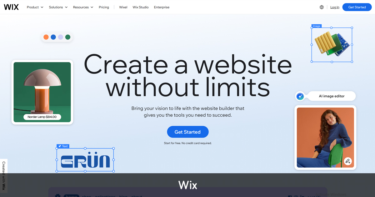
Wix is a popular and user-friendly web building platform with a huge inventory of customizable templates and a drag-and-drop facility. It is perfect for small businesses, freelancers, and creatives because it enables users to create websites that look professional without knowing any code. Wix provides a versatile platform for creating anything from a personal blog to an entire online store, all at a reasonable cost, thanks to its integrated SEO tools, mobile-responsive designs, and optional eCommerce features.
2. Zyro

With Zyro, anyone can make a high-quality website in no time at all, regardless of their level of experience or knowledge of code, thanks to its intuitive interface and reasonable prices. It has a variety of editable templates, a simple drag-and-drop editor, and built-in AI features for making designs and content. Zyro is a flexible option for affordable website construction; it is perfect for personal projects, small businesses, and portfolios, and it even has eCommerce capabilities on higher-tier plans.
3. WordPress.com
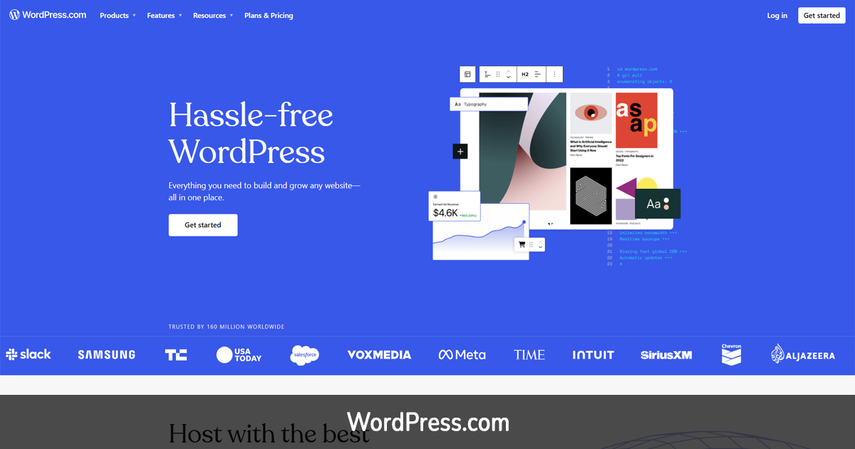
Whether you’re starting a personal blog, a company website, or a portfolio, WordPress.com is a popular platform that makes website creation easy. Its adaptability stems from the many available themes, plugins, and settings for personalization. While both free and paid options are available, premium customers have access to more features, including expanded storage and personalized domains. WordPress.com provides a robust platform with an intuitive design, making it a great option for anyone looking to start small but expand as their requirements increase.
4. Weebly

Websites, online shopfronts, and blogs may be quickly and easily created with the help of Weebly’s drag-and-drop website builder. Thanks to its user-friendly interface, Weebly is perfect for those who are just starting and don’t know how to code but still want a website. A selection of reasonably priced plans is available, and it comes with some editable templates and integrated eCommerce features. If you own a small business or just want to maintain a personal blog, Weebly has everything you need to create a complicated, professional-looking site.
Final Thoughts
Before you choose the most affordable website builder, consider other factors. Think about the objectives, design requirements, and level of personalization you desire for your site. Try out a few before you commit; most platforms offer free trials.
A stunning, fully-functional website can be yours without draining your resources. Modern tools and technologies have revolutionized web design, allowing you to create the website of your dreams efficiently and affordably. The key is choosing the right platform and working with experts who understand your vision.

